AMP Electricals – Logo & Brochure Design
Smit Branding Private Limited, a branding agency in Rajkot, designed the logo and company brochure for AMP+ Electricals, an electrical engineering solutions company. The electrical company logo design turns the letters A and P into a plug and cord that connect straight into the name, and the brochure carries that teal-and-charcoal look into print.
Brand Identity • Electrical Engineering
Logo Design • Brochure Design
(about the client)
About AMP+ Electricals
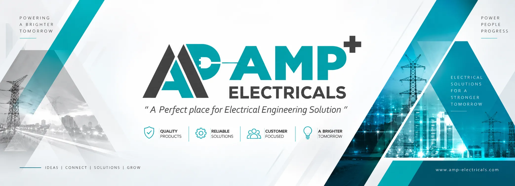
AMP+ Electricals calls itself “a perfect place for electrical engineering solution”, supplying quality products and reliable solutions to its customers.
Its work sits across power, infrastructure and industry, from transmission lines to factories and city projects. The company needed an identity that looks technical enough for engineers and buyers, yet simple enough to remember after one meeting.
(the logo)
A Monogram That Plugs In
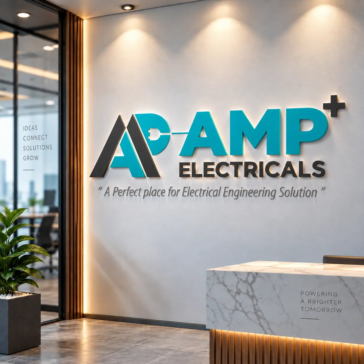
The symbol overlaps a charcoal A and a teal A. The second stroke curves into a P, and the bowl of that P is shaped as a plug, with a cord running out of it straight into the word AMP. The mark is literally wired to the name.
AMP sits in heavy teal capitals with a charcoal plus sign raised above the P, which turns the name into AMP+, and ELECTRICALS sits in charcoal below. The tagline runs underneath in a light italic.
- Teal for energy, charcoal for engineering, so the two colours do the talking
- Sharp diagonal strokes that repeat as the triangles and slashes on the banner and brochure
- Built to stand up as a 3D reception sign as well as on paper
Click any image to view it full size.
(the brochure)
A Brochure Cut From the Logo
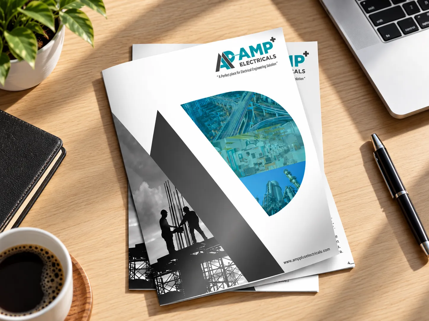
The brochure cover borrows the logo’s diagonal. A large charcoal wedge slices across the page, with a black-and-white photo of engineers on a steel structure on one side and a half-circle of teal-tinted images on the other: a city interchange, a factory floor and an industrial plant.
The effect is two moods on one cover: the hard work on site in grey, and the finished, powered-up result in teal. The logo and tagline sit at the top.
Click any image to view it full size.
(deliverables)
What We Delivered
- Logo design: plug-and-cord monogram and AMP+ wordmark
- Company brochure design
(the result)
A Brand That's Switched On
AMP+ Electricals now has a logo that says what the company does before anyone reads a word: the plug, the cord and the plus sign do the work.
The brochure carries the same teal, charcoal and diagonals, so the company looks the same in a client meeting as it does on its office wall.
(frequently asked questions)
Questions About Electrical Branding
1. What makes a good logo for an electrical company?
A symbol that hints at the trade without relying on lightning bolts every competitor uses. AMP+ Electricals' monogram turns its own initials into a plug and cord that connect into the name, so the idea of power belongs to this brand alone.
2. Which colours work for an electrical engineering brand?
Colours that feel technical and calm rather than loud. For AMP+ we paired teal, which reads as clean energy, with charcoal, which reads as engineering and steel, and kept that pair on every piece from the sign to the brochure.
3. What should an electrical company brochure include?
A cover that shows the kind of work you do, then your products and solutions, the sectors you serve and how to reach you. The AMP+ cover uses site photography and images of infrastructure, industry and city projects to set that context at a glance.
4. Can a logo and brochure be designed together?
Yes, and it saves time. Designing them together let us take the logo's diagonal strokes straight into the brochure's layout, so the two look like one system from day one.
5. Does Smit Branding work with engineering and industrial companies?
Yes. Alongside AMP+ Electricals, we have branded industrial businesses across Gujarat, including electrical service company Raj Electric Works in Gandhidham and solar BOS maker Creton Industries in Rajkot.
Need a logo that explains your business? See how we branded Raj Electric Works and Creton Industries, or talk to our team.