Arham Fincap – Logo, Brochure & Exhibition Stall Design, Rajkot
Smit Branding Private Limited, a branding agency in Rajkot, designed the logo, company brochure and exhibition stall for Arham Fincap, a Rajkot insurance and investment advisory firm. The financial company branding carried one red-and-blue identity from the office sign to a 3-day exhibition, where the stall drew 1,200+ visitors.
Brand Identity • Exhibition Branding • Finance
Logo Design • Company Brochure Design • Exhibition Stall Design

(about the client)
About Arham Fincap
Arham Fincap is a Rajkot financial advisory firm working under the line “Insure | Invest | Grow | Secure”. It advises individuals and businesses on life insurance (term, retirement, child education and marriage plans, ULIPs, savings and NRI cover), general insurance (health, personal accident and travel) and business insurance, from keyman and partnership cover to group term life.
On the investment side, it offers mutual funds through SIP, SWP, STP and ELSS. Its stated values are integrity, initiative and involvement, and its promise is to act in customers’ best interests with fair dealing as the basis of the business.
(the challenge)
Trust First, Products Second
People decide whether to trust an adviser with their family’s future before they compare a single policy. Arham Fincap needed to look warm and dependable at the same time.
It also had a long product list to explain. More than twenty plans across life, general and business insurance, plus four ways to invest in mutual funds, had to be laid out in a brochure and on a stall so a visitor could find their need in seconds.
(the logo)
A Signature You Can Trust
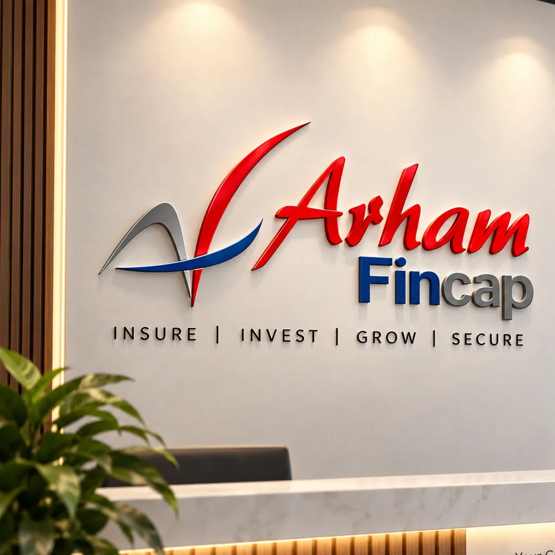
The symbol is built from three strokes: a grey peak and a red sweep that together form an A, crossed by a blue swoosh that rises to the right. It reads as a letter, a tick and an upward curve all at once, which suits a business about growth and protection.
“Arham” is set in a flowing red script, like a signature on a policy, and “Fincap” sits below in solid type, with Fin in blue and cap in grey. The four-word line Insure | Invest | Grow | Secure runs underneath.
- Red for warmth, blue for stability, grey for calm
- A script name that feels personal, beside a solid word that feels established
- Works as a 3D office sign and at the top of every brochure page and stall panel
Click any image to view it full size.
(company brochure)
Twenty Plans, Easy to Find
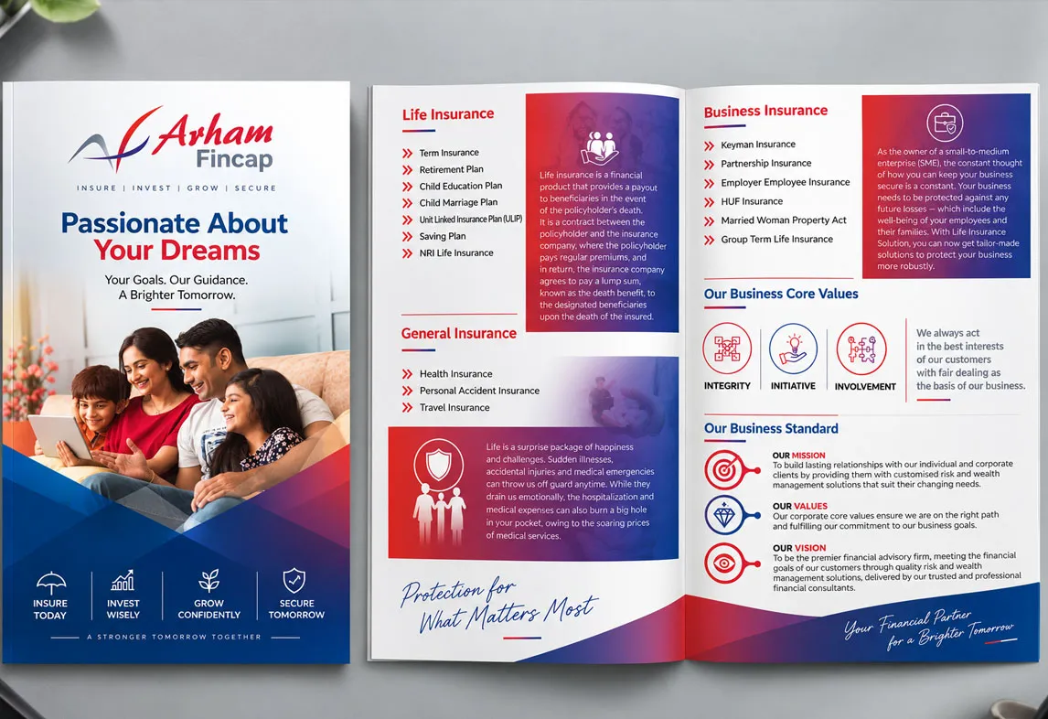
The brochure cover leads with a family on a sofa and the headline “Passionate About Your Dreams”, with four icons at the foot: Insure Today, Invest Wisely, Grow Confidently, Secure Tomorrow. Inside, each spread follows one pattern:
- A red heading for each category: life, general and business insurance
- A short list of plans marked with red chevrons, so the eye can scan
- A red-to-blue panel explaining the category in plain words
- Core values and mission, values and vision to close, with the line "Your Financial Partner for a Brighter Tomorrow"
Click any image to view it full size.
(exhibition stall)
A Stall That Reads Like a Menu
We designed the stall as nine tall panels wrapped around an open seating area, so a visitor can walk the walls and find their product without asking. The centre panel carries the logo and Arham’s promise to act in customers’ best interests. Around it:
- Left wall: life, general and business insurance, each with its plan list and an illustration
- Back wall: core values on one side, mission, values and vision on the other
- Right wall: mutual funds explained, then SIP, SWP, STP and ELSS as icon panels
- Front: a branded counter and a brochure stand, so every conversation ends with a take-home

Click any image to view it full size.
(deliverables)
What We Delivered
- Logo design
- Company brochure design
- Exhibition stall design: nine wall panels and a branded counter
(the result)
1,200+ Visitors in Three Days
Arham Fincap went into the exhibition with one look across the sign, the brochure and every stall panel, and the numbers followed:
- Over the 3 days of the exhibition, Arham Fincap’s stall drew 1,200+ visitors.
- The team collected 350+ enquiries across life, health and business insurance and mutual funds.
- All 500 printed brochures were handed out by day two.
(frequently asked questions)
Questions About Financial Branding
1. Why does an insurance or investment firm need professional branding?
Because clients decide whether to trust an adviser before they compare plans. A steady, consistent identity signals that the firm is careful and established, which matters when people are sharing money and family details.
2. How do you design an exhibition stall for a financial company?
Turn the walls into a menu. Arham Fincap's stall gives each product family its own panel, life, general and business insurance on one wall and mutual funds on the other, with values and the brand promise in the centre, so visitors find their need without asking.
3. What should an insurance company brochure include?
Each category with its plans listed clearly, a plain-language explanation of what the cover does, and the firm's values and mission. Arham's brochure pairs every plan list with a short explainer panel and closes with core values and vision.
4. How many visitors can a well-designed stall attract?
It depends on the event, but design makes a measurable difference. Arham Fincap's stall drew 1,200+ visitors over 3 days, collected 350+ enquiries, and handed out all 500 printed brochures by day two.
5. Can Smit Branding print the brochures and stall panels it designs?
Yes. We design and print in-house in Rajkot, so artwork, sizes and colours are checked together and the panels and brochures match the approved designs.
6. Does Smit Branding work with finance companies in Rajkot?
Yes. Arham Fincap is a Rajkot firm, and we have also worked with local finance businesses such as Quick Step Finance and Sarru Finvests.
Exhibiting soon? See our trade show booth design service, our graphic design work in Rajkot, or talk to our team.