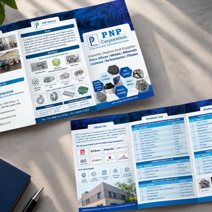
Jaliyan Epitome – Commercial Real Estate Branding, Kalawad Road, Rajkot
Smit Branding Private Limited, a branding agency in Rajkot, designed the logo, building signage and sales brochure for Jaliyan Epitome, a premium commercial project on Kalawad Road, Rajkot. The real estate branding presents the building as a business address with ambition, under the line “Where Ambition Meets Its Peak”.
Real Estate Branding • Commercial Project
Logo Design • Signage Design • Real Estate Brochure Design
(about the project)
About Jaliyan Epitome
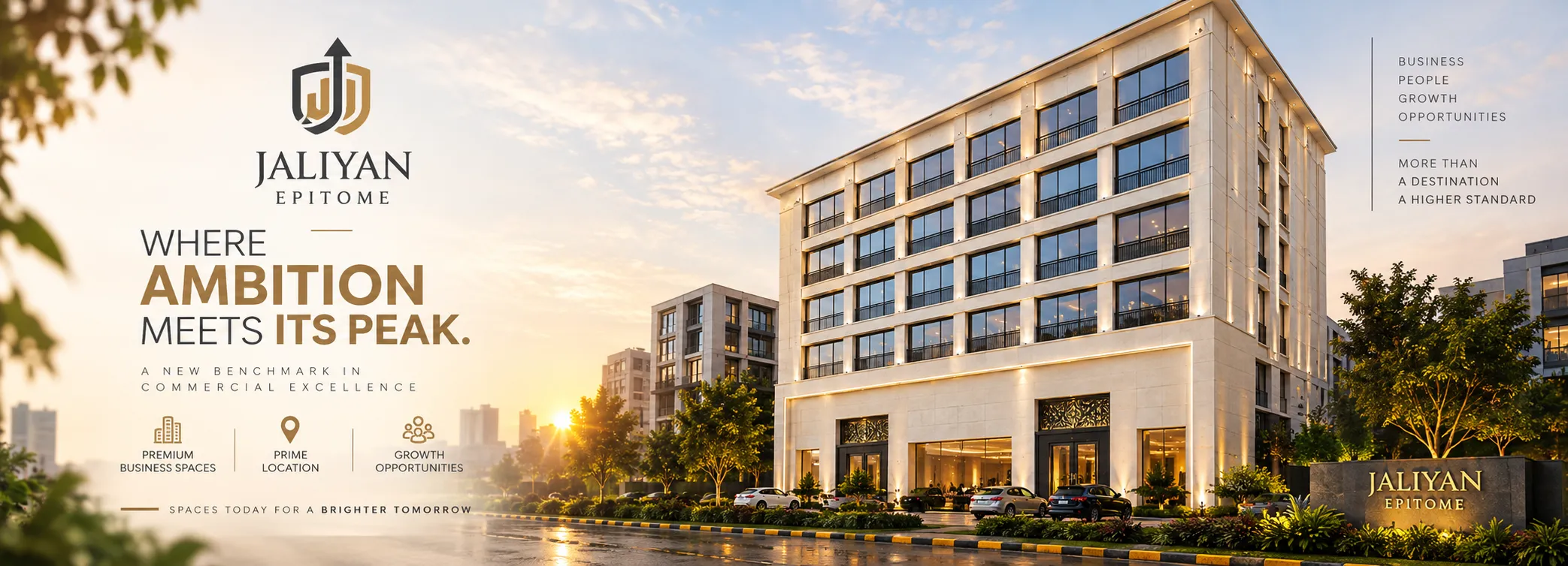
Jaliyan Epitome is a commercial project by Jaliyan Buildcon, developed by Arth Properties, on Kalawad Road opposite Neptune Tower, Kotecha Nagar, one of Rajkot’s most sought-after business addresses.
The building offers premium business spaces with a glass-fronted ground floor, offices above and parking for visitors. It is RERA-registered, and it is sold to business owners and investors who want an address that says something about their company.
The developer needed a brand that could stand next to the building’s cream stone facade and sell it before it was finished: a name to put on the wall, and a brochure to put in a buyer’s hands.
(logo & signage)
A Mark That Points Upward
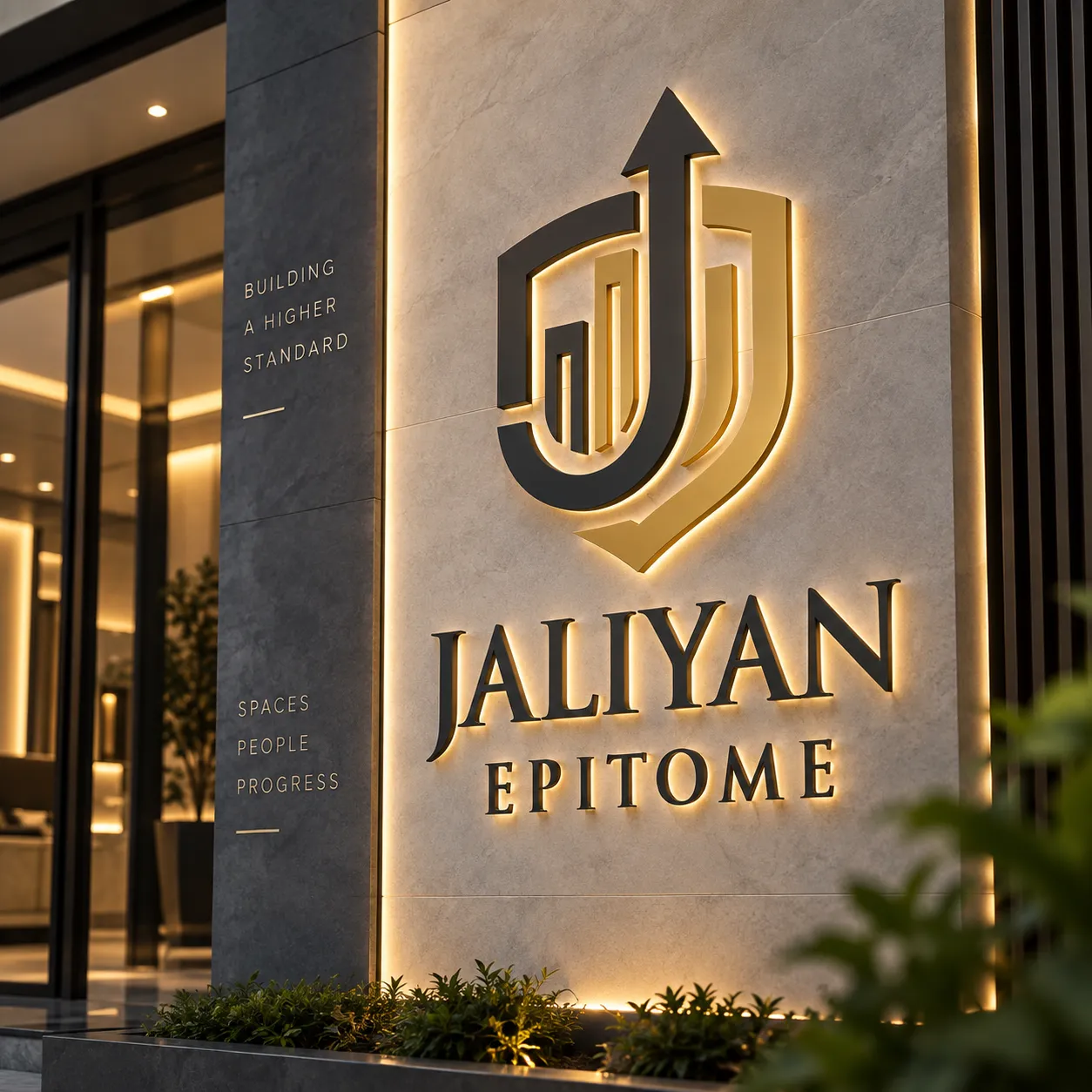
The symbol is a shield in charcoal and gold. Inside it, a bold J rises into an arrow that breaks out through the top, beside a set of ascending bars like a growth chart. In one mark it says protection, growth and the J of Jaliyan.
“JALIYAN” is set in classic serif capitals with “EPITOME” spaced beneath. Charcoal and soft gold were chosen to sit against cream stone, so the logo reads as part of the architecture, not a sticker on it.
- Facade signage: the logo in raised, backlit letters on a stone panel beside the entrance
- Entrance monolith: a low stone sign carrying "Jaliyan Epitome" in gold at the driveway
- Brand lines on the side panels: "Building a Higher Standard" and "Spaces, People, Progress"
Click any image to view it full size.
(real estate brochure)
Selling the Workday, Not the Walls
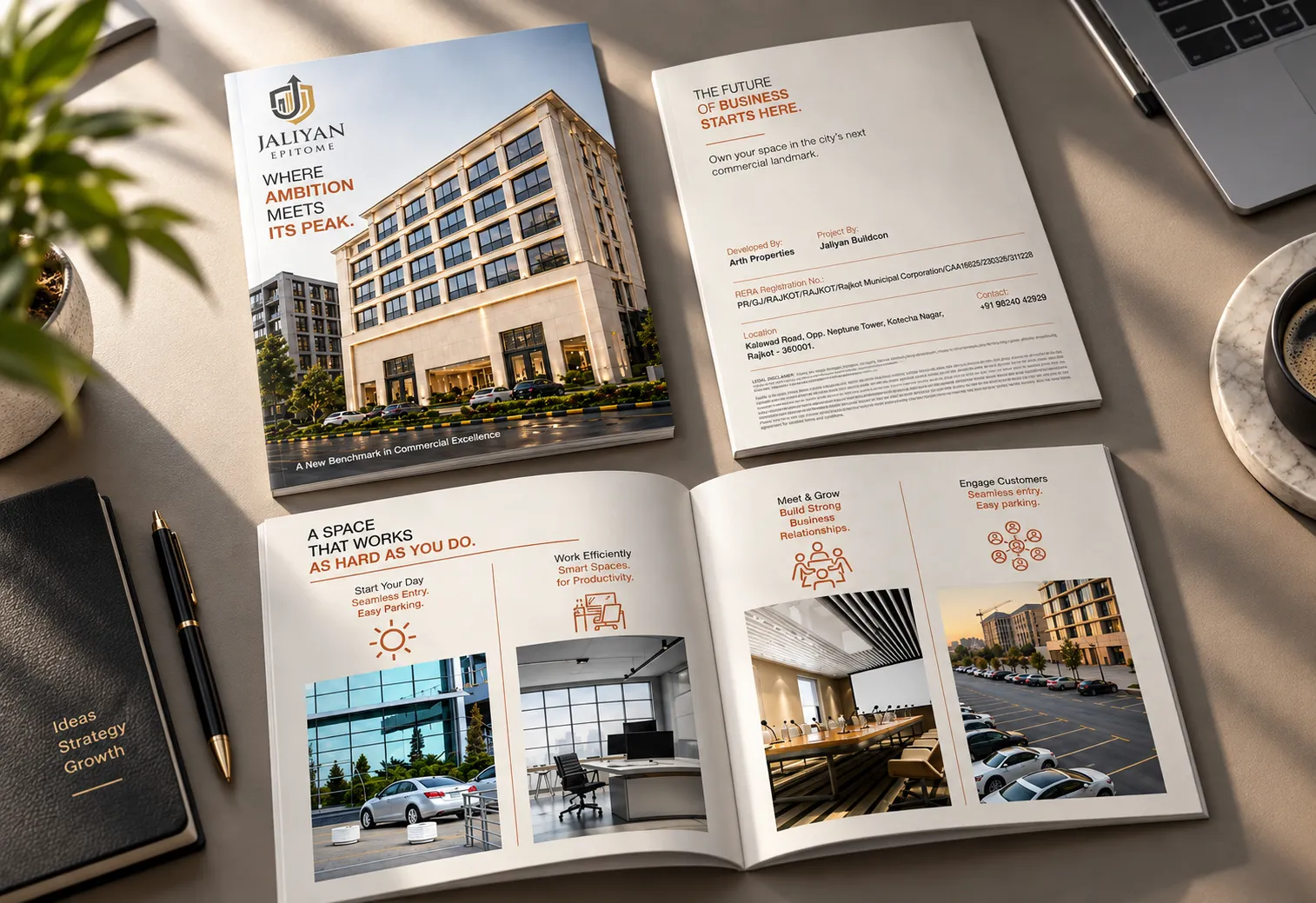
A commercial buyer isn’t buying square feet; they are buying how their business will run there. So the brochure, in warm grey with copper accents, walks through a working day instead of listing specifications:
- Cover: the building at golden hour with "Where Ambition Meets Its Peak" and "A New Benchmark in Commercial Excellence"
- Project page: "The Future of Business Starts Here", with developer, RERA number, location and contact
- "A Space That Works As Hard As You Do": four moments, Start Your Day, Work Efficiently, Meet & Grow and Engage Customers, each with a line icon and a photo
Click any image to view it full size.
(deliverables)
What We Delivered
- Logo design
- Building facade and entrance signage design
- Commercial real estate brochure design
(the result)
A Building With a Name
Jaliyan Epitome now carries one premium identity from the facade to the sales table. The shield logo and gold lettering on the building match the brochure a buyer takes home, so the project looks as finished on paper as it will on Kalawad Road.
The brochure gives the sales team a clear story to tell: the address, the RERA details and what a working day there feels like.
- 60% of units were booked within 6 months of launch.
(client words)
In the Client's Words
“We wanted Jaliyan Epitome to look like a landmark before it was finished. The logo on the facade and the brochure tell the same story, and buyers notice it at the very first meeting.”
Mr. Amit R
Jaliyan Buildcon, Rajkot
(frequently asked questions)
Questions About Real Estate Branding
1. What does branding for a commercial real estate project include?
At minimum, a project name and logo, signage for the building and a sales brochure. For Jaliyan Epitome on Kalawad Road we designed all three, so the identity on the facade matches what buyers see in the brochure.
2. How is a commercial project brochure different from a residential one?
Commercial buyers care about how their business will run, not just the space. Jaliyan Epitome's brochure walks through a working day, from easy entry and parking to smart workspaces, meeting rooms and customer access, instead of only listing floor plans.
3. What should a real estate brochure include for compliance?
The RERA registration number, the developer and project names, the site address and a contact number, along with a legal disclaimer. The Jaliyan Epitome brochure carries all of these on a dedicated project page.
4. Why design signage along with the logo?
A building's name is seen most on its facade. Designing the logo with signage in mind meant Jaliyan Epitome's shield and gold serif letters work as backlit 3D lettering on stone, and as a smaller entrance monolith at the driveway.
5. Which colours suit a premium commercial building brand?
Restrained ones that match the architecture. Jaliyan Epitome uses charcoal and soft gold against its cream stone facade, so the brand feels premium and permanent rather than promotional.
6. Does Smit Branding work with real estate developers in Rajkot?
Yes. Alongside Jaliyan Epitome on Kalawad Road, we have branded real estate projects such as Casa Green – The Royal Residency in Surendranagar and worked with Babiya Infrastructure and the Real Estate Agents Association of Rajkot.
Launching a project? See how we branded Casa Green – The Royal Residency and Babiya Infrastructure, or talk to our team.